XenVn Style for Xenforo 2

XenVn Style for Xenforo 2 2.3.6

XenVn-Style-for-Xenforo-2.3.webp


A clean and professional style for Xenforo 2.3 with light blue tones, optimized color contrast, perfectly compatible with XenVn addon for best SEO score, and also a best xenforo style.
  • Simple interface
  • Standard color contrast
  • Light / dark tones
  • Requires Xenforo version 2.3.4+ (and XFRM version 2.3.4+)
  • Just import XML file and use, nothing more needed
  • In XenVn addon settings, select Extra tab -> select Extra Mods For XF (optional)
All VIP Members will be able to download this style.

Note: XenVn Style copyright belongs to XenVn.Com, you are allowed to use it on your pages, but are not allowed to re-share or re-sell. If found violating, your XenVn addon copyright license will be revoked and your account will be permanently banned.


Installation Instructions:
  • Go to: Appearance -> Styles -> Import
  • Select the file style-XenVn.xml
  • Press the Import button
Upgrade / Update Instructions:
  • Go to: Appearance -> Styles -> Import
  • Select the file style-XenVn.xml
  • In the Overwrite style section, select XenVn
  • Press the Import button
Logo Settings:
  • Go to: Appearance -> Styles
  • Select style: XenVn -> Style properties
  • Select the Basic options section
  • Change the logo for your site
Create Child Style:
  • Go to: Appearance -> Styles
  • Select style: XenVn
  • Uncheck: Allow user selection
  • Save and go back, select the Add style button
  • In Title field: Enter the name of your child style
  • In Parent style: Choose XenVn style
  • Click Save
Now if you want to change the settings of XenVn style, do it in the child style, it will not be lost when you update the parent style.

1735516005233.webp

Demo:
https://xenvn.com/misc/style?style_id=2

Download XenVn - All In One Tools for Xenforo 2

All VIP Members will be able to download this style.

This is beta version, any contribution to improve please discuss here, thanks. I did use some ideas from some other Styles.


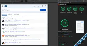
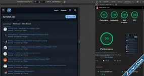
Mobile SEO:
XenVn-Style-mobile-light.webp XenVn-Style-mobile-dark.webp

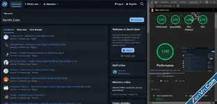
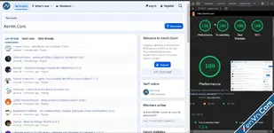
Desktop SEO:
XenVn-Style-desktop-dark.webp XenVn-Style-desktop-light.webp
 

Attachments

Last edited:
1733508179310.webp


There are too many elements in the my navmenu and it doesn't fit on the screen. I would like to remove the “Username” part that I have marked. Is there any chance to make it “optional”?

Thank you.
 
1733508179310.webp

There are too many elements in the my navmenu and it doesn't fit on the screen. I would like to remove the “Username” part that I have marked. Is there any chance to make it “optional”?

Thank you.
You do that from CP/setup/public navigation
 
1733508179310.webp

There are too many elements in the my navmenu and it doesn't fit on the screen. I would like to remove the “Username” part that I have marked. Is there any chance to make it “optional”?

Thank you.
You can use this css:
CSS:
You must log in to view
(3 lines)
 
1733525642580.webp


when I add a CODE tag, the text above and below it seems to intertwine a lot.
Can you slightly increase the margin top and bottom values of this field.
My sample uses are usually:
Text before
Code:
You must log in to view
(1 lines)
Text after

in the form of
 
Similar threads Most view View more
Back
Top Bottom