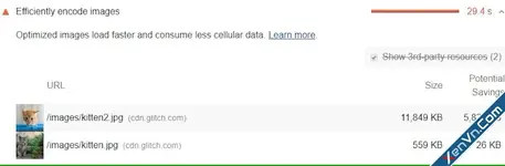
Optimizing images will make the page load faster and consume less data. Serving desktop-sized images to mobile devices can use 2–4x more data than needed. Instead of a "one-size-fits-all" approach to images, serve different image sizes to different devices.
Serve multiple image versions
Specify multiple image versions and the browser will choose the best one to use:
| Before | After |
|---|---|
| <img src="flower-large.jpg"> | <img src="flower-large.jpg" srcset="flower-small.jpg 480w, flower-large.jpg 1080w" sizes="50vw"> |
Responsive images are the set of techniques used to load the right image based on device resolution, orientation, screen size, network connection, and page layout. The browser should not stretch the image to fit the page layout, and loading it shouldn’t result in time & bandwidth wastage. It improves user experience as images load fast and look crisp to the human eye.
The "srcset" attribute
The srcset attribute is a comma-separated list of image filenames and their width or density descriptors.
This example uses width descriptors. 480w is a width descriptor tells the browser that flower-small.jpg is 480px wide; 1080w is a width descriptor tells the browser that flower-large.jpg is 1080px wide.
"Width descriptor" sounds fancy but is just a way to tell the browser the width of an image. This saves the browser from needing to download the image to determine its size.
The "sizes" attribute
The sizes attribute tells the browser how wide the image will be when it is displayed. However, the sizes attribute has no effect on display size; you still need CSS for that.
The browser uses this information, along with what it knows about the user's device (i.e. its dimensions and pixel density), to determine which image to load.
If a browser does not recognize the "sizes" attribute, it will fallback to loading the image specified by the "src" attribute. (Browsers shipped support for the "sizes" and "srcset" attributes at the same time, so a browser will either support both attributes or neither.)
With Xenforo 2, you just need to install XenVn addon, then enable: Attachments -> Add Responsive Image, and rebuild Tools -> Rebuild caches -> Responsive images cache.
https://xenvn.com/threads/responsive-images-for-xenforo-2-attachments.3230/
XenVn add-on will automatically compress your images and create responsive images (works only with image attachments).
Install Imagemagick PECL extension to get the best performance.